

2026
Finalist
People's Choice Award
Marion Performing Arts Center
People's Choice
OPN Architects

Alex Michl


No items found.
Driven by seat count and sent back to the drawing board by pandemic cost inflation, the design of the new performing arts venue at Marion Independent School District illustrates how color can cost-effectively create impact.
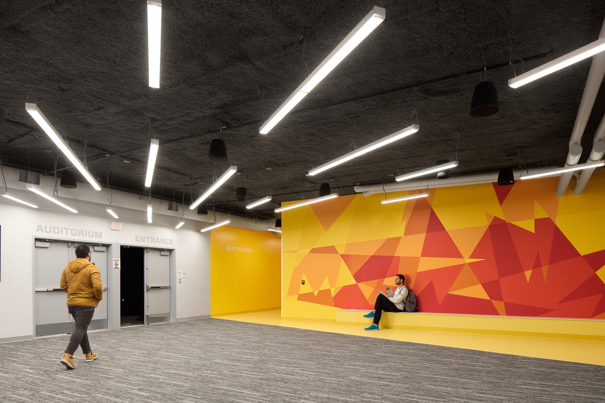
From a reconfigured entry sequence to a pre-function and rehearsal space that doubles as a storm shelter to the 760-seat auditorium, the 18,000-square-foot addition is an exercise in multi-functionality, efficiency, and creating interest and whimsy with basic materials.
By necessity, a performing arts venue is large, windowless volume. Because the addition is located at the front of the school, the exterior needed to sing as much as the interior. The flat concrete of the pre-cast structure is painted grey. In shades of lighter grey and white, the school’s name is spelled out in shapes meant to emulate the beams of a spotlight. Completed on the heels of a district rebrand, the school’s new mascot – a wolf – is intentionally placed at eye level to create insta-worthy moments as students and families enter the new venue for events.
The neutral exterior is in stark contrast to vibrant color inside the lobby, where the same dynamic abstract spotlight beams – this time in the school’s signature red and yellow – hide the letter M in many shapes and sizes. The ceiling is sprayed to dampen sound in what is essentially a concrete bunker to meet IC-500 storm shelter ratings. In order to maximize storm shelter square footage, a single low bench creates minimal seating.
In this room and in the adjacent practice room, utilitarian lights are hung creatively. In the prefunction lobby, the lights and carpet both direct patrons to the auditorium entrance. In the flat-floor rehearsal space, the lights form multiple Ms in the mirror wall’s reflection. This room can also be a black box theatre, with curtains that move to cover the mirror, which is intentionally the exact dimensions as the stage opening.
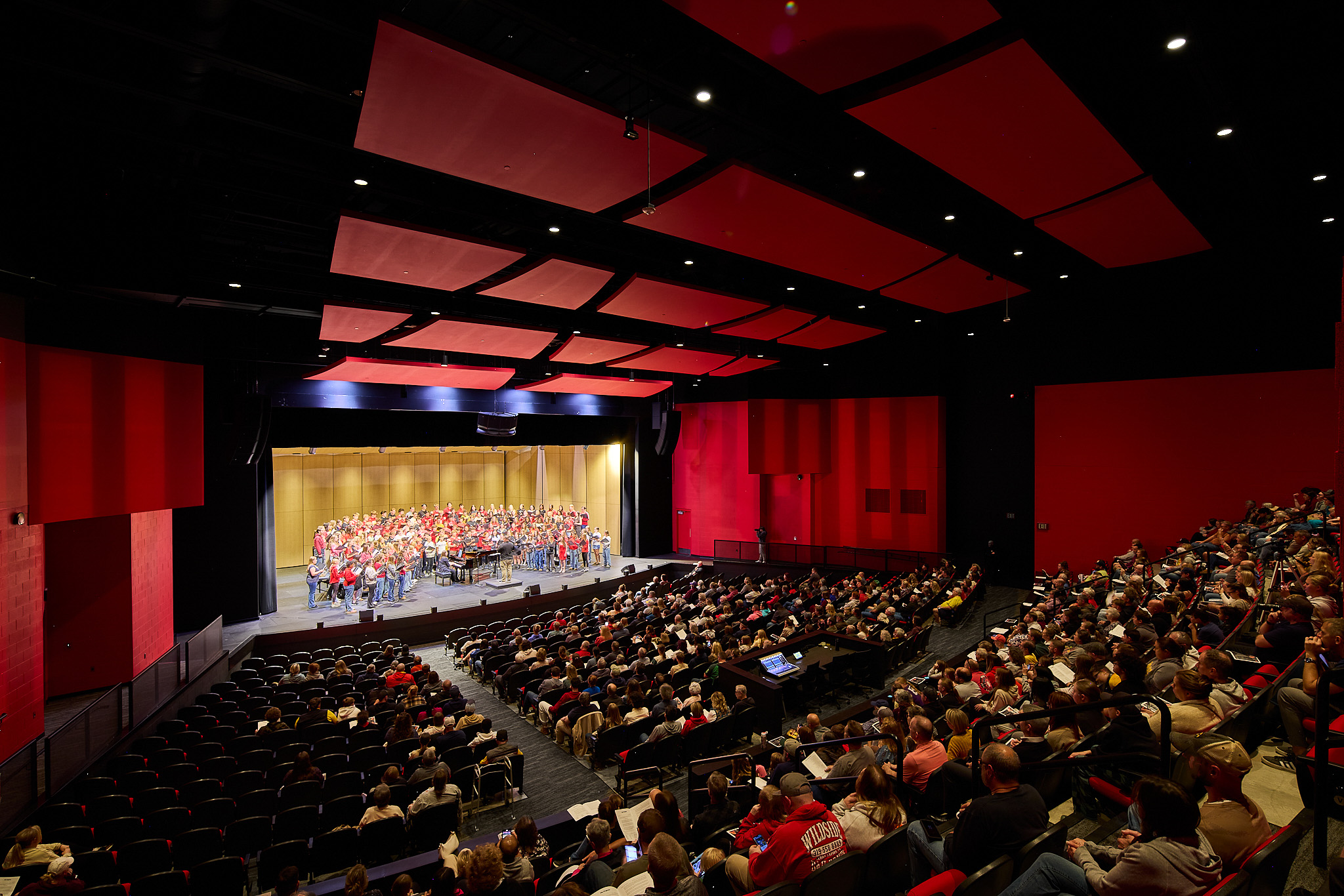
Color again is the star of the show in the auditorium, where red drenches the walls and covers the seat cushions. The view is intentionally more dramatic from the stage, and less so from the audience’s perspective, with black seat backs and a blonde oak concert shell breaking up the color’s intensity.
The dramatic red paint and strategic lighting also serve to camouflage the mix of concrete block and drywall on the cheek walls. The material choice was driven by cost, not preference, in a space where the budget was preserved for lighting, acoustics, and technology, as well as comfortable seating – all of which support the spaces’ function above all else.
In this room an M appears again, this time hidden on the ceiling in acoustic panels, visible only from the audience’s vantage point.
For a district that waited decades to finally have a space that supports its award-winning fine arts program, the new auditorium meets and exceeds the community’s anticipation with a dramatic palette that makes the most of a finite budget.
